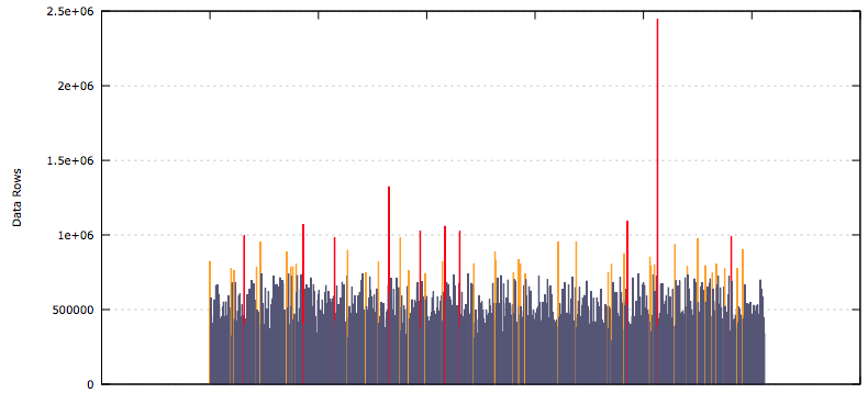
These results are from a development environment where I was testing out my scripts, but it clearly shows how some partitions can get filled at a much quicker rate than others. Each of the bars is an individual partition, the height of the bar represents the number of rows of data in that partition.
The SQL behind this graph is very simple...adjust the like statement to suit. In my case I get data for multiple tables and then filter it later in a shell script.
SQL
select up.table_name, up.partition_name, up.num_rows
from user_tab_partitions up
where table_name like 'MY_TABLES_%'
order by up.table_name, up.partition_name asc;
I export the result of this query to a file called export.d. This has to be a tab-delimited file that doesn't use quotes around each of the data values. The data looks something like this...
export.d
...
MY_TABLES_TBL1 SYS_P42665 822568
MY_TABLES_TBL1 SYS_P42666 394797
...
This is then processed by a shell script.
To make the graph, I used gnuplot with the following shell script to generate the image...
Bash Script
#!/bin/bash
function plot {
gp_table=$1
gp_file=$2.$1
grep $1 $2 > $gp_file
gp_95pct=`cat $gp_file|awk '{print $3}' |sort -n|awk 'BEGIN{i=0} {s[i]=$1; i++;} END{print s[int(NR*0.95-0.5)]}'`
gp_99pct=`cat $gp_file|awk '{print $3}' |sort -n|awk 'BEGIN{i=0} {s[i]=$1; i++;} END{print s[int(NR*0.99-0.5)]}'`
$GNU_PLOT << EOF
set terminal svg size 800,400 noenhanced font "Verdana,10"
set output "export_$gp_table.svg"
set title "Table Partitions Row Sizing: $gp_table"
set ylabel "Data Rows"
set grid y
set format x ''
set style fill solid 1.0
set palette defined (0 "red", 1 "#FFA500", 2 "#555577")
unset colorbox
plot "$gp_file" using 0:3:(\$3 > $gp_99pct ? 0 : (\$3 > $gp_95pct ? 1 : 2)) with boxes palette notitle
EOF
rm $gp_file
}
GNU_PLOT=gnuplot
plot MY_TABLES_TBL1 export.d
What this bash script does is define a function called plot, then it defines the gnuplot executable and calls the plot function passing in the name of the table to filter by and the name of the data file.
Inside the plot function, I use grep to get the data for the table that's been passed in. Then awk is used to calculate the 95th and 99th percentile values for the data points in the filtered file. These are used for colouring the bars. 95th percentile bars are orange and 99th are red, others are blue-gray.
This is all followed by calling gnuplot to generate the bar graph, and then the filtered file is cleaned up.
It's all quite simple, it did take me a long time to get the syntax right for gnuplot however. In my actual script I also have a loop to process all of the tables in the exported file all in one go.
-i
