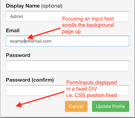
To reiterate the problem below is a video that shows how the background page jumps to the top whenever an input field gets focus (the field appears in a fixed position DIV)...
My solution depends on having two main fixed position DIVs. The first one is the page 'header', the second is the page 'body wrapper'. These together take up 100% of the page height. Inside the 'header' is another DIV that holds all of the popup DIVs that I wish to display (not visible initially). The 'body wrapper' DIV is another fixed position DIV that is simply offset from the top by the value equal to the height of the 'header' DIV. This DIV has it's overflow-y set to 'scroll' so the scroll event can be captured. Inside the 'body wrapper' DIV is another DIV that contains the actual content of the page.
Now when I display a popup, since it's inside the header which is always visible, the 'body wrapper' isn't affected. Perfect!
Here's the HTML...
HTML
<body>
<div class="tb_header">
...header content...
<div class="tb_popup_holder">
...popup divs...
</div>
</div>
<div class="tb_body_wrapper">
<div class="tb_body">
...body content...
</div>
</div>
</body>
...and the CSS (leaving out any extra styling)...
CSS
html, body {
margin: 0 0;
height: 100%;
width: 100%;
}
.tb_header {
width: 100%;
height: 40px;
position: fixed;
left: 0;
top: 0;
}
.tb_body_wrapper {
padding-bottom: 40px;
height: 100%;
width: 100%;
position: fixed;
left: 0;
top: 40px;
overflow-y: scroll;
}
.tb_body {
width: 100%;
display: inline-block;
}
The 'body wrapper' has a 40px padding at the bottom so that any content that goes to the end of the page isn't cut off due to the 40px header.
Now I can listen to the scroll event on the 'body wrapper' like so:
JavaScript
$('.tb_body_wrapper').scroll(function() {
// handle scroll
})
-i
