This whole article came about because I was trying to change my allocated seats via the app. A process I've done many a time and every time I felt lost, so I thought I'd try and trace out the steps to see where it failed.
At first glance the app looked quite nice. It seemed to use native components and appeared fairly polished. That was true until trip management actions are required. That was when the app forgot about native components and instead overlaid a web view complete with back/forward navigation and the refresh button. Not only was that cumbersome and looked ugly but if that Refresh button was tapped accidentally, the initial 'Manage your booking' page was reloaded - losing context and any unsaved changes.
So lets see some screenshots I took and while at it, I've also counted how many screen taps were required to get to the page that finally let me change my seat.
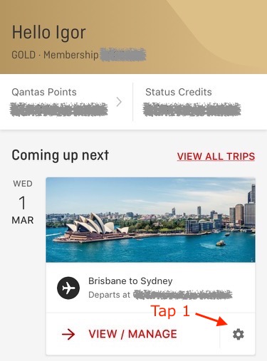
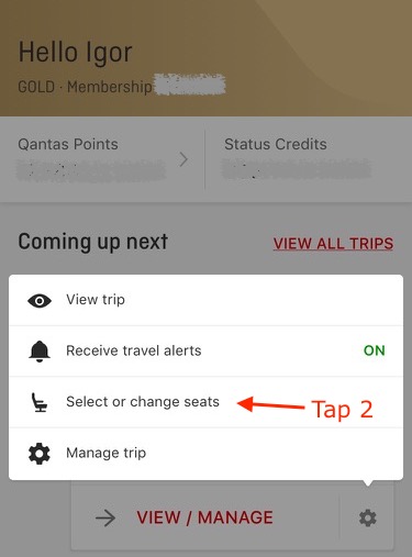
The above was OK so far. All native. After the second tap, however, it got into bad UX space with an overlaid web view component.
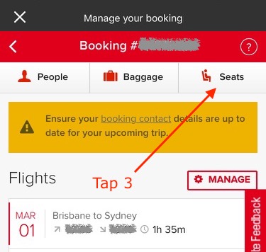
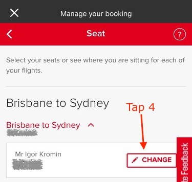
Well that was bizarre! You would have thought that after tapping 'Select or change seats' you would be taken to the page that let you select or change seats, instead you were shown a 'Manage your booking' page and had to tap 'Seats' to proceed. Hang on though, after tapping 'Seats' you had to tap 'Change' in order to actually change the seats! That's 4 taps to get to the page that should have really taken 2, at most 3 taps to get to.
The overlaid web view component completely changed the look and feel and introduced buttons that were not necessary or worked as intended. For example the back/forward/refresh buttons are not necessary and just take up valuable screen space. The left chevron button at the top of the page did not have the intended behaviour of returning you back to the app, it seemed to work as a standard back button instead, just like the one at the bottom of the page. The placement of the X in the top left corner seemed confusing (and misaligned) by being above the left chevron - do we want to go back or close, isn't it logically the same? Whoever designed this part of the app obviously never intended to use it themselves.
There was more bad design though...
The 5th tap finally lets you select your seat! Phew! However, to accept the new seat selection, you have to click 'Finish' which happens to be directly above the web view refresh button. If you accidentally clicked that refresh button instead, you were taken back to the 'Manage your booking' page from several clicks ago and had to start all over!

So there you go. Using web views in native apps definitely has its time and place, but when done incorrectly it makes for a terrible user experience and really cheapens the app. Hopefully Qantas will do something about it and for anyone else working on UX for apps, it should be a lesson learned in mistakes to avoid.
-i
