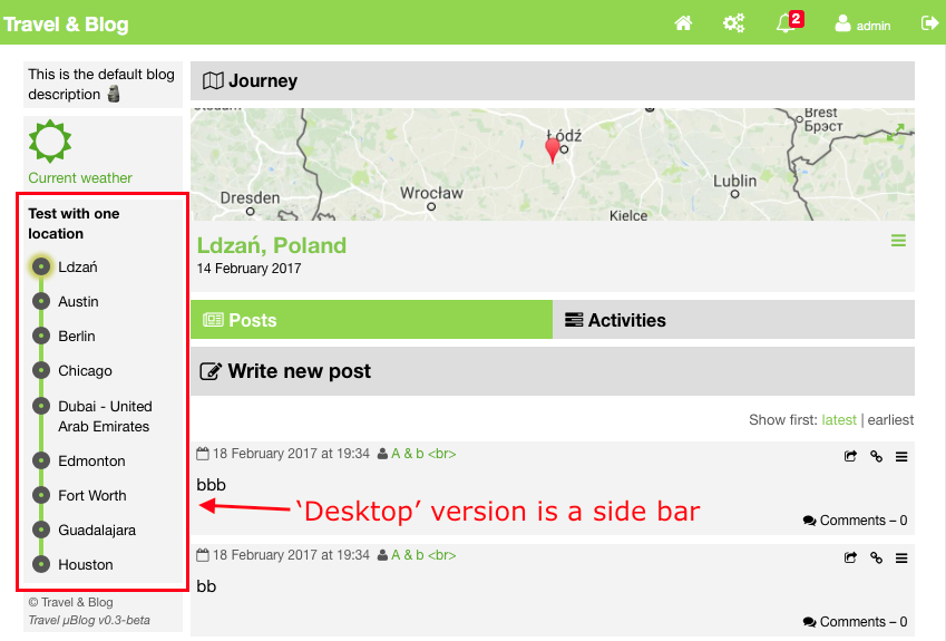
This is what the two versions look like...

My use cases were: 1. display the desktop sidebar for desktop sized pages 2. do not display any sidebar on mobile version 3. allow a toggle of the timeline on the mobile version only.
What I realised very quickly was that if I simply toggled the mobile version of my timeline that as soon as the browser window would be resized to 'desktop' size it would mess up my page because the mobile version of the timeline would still be visible.
So instead of using the jQuery toggle() method to toggle the mobile timeline DIV, I used the toggleClass() method instead. That required me to set up some CSS as follows:
CSS
.mobile_popover {
display: none;
...
}
.mobile_visible {
display: none;
}
@media screen and (max-width: 768px) {
.mobile_visible {
display: block;
}
}
...and the HTML for the mobile timeline DIV is something like...
HTML
<div class="mobile_popover">...</div>
The mobile timeline DIV has the mobile_popover class set, so it's not visible by default. The mobile_visible class is set up with a media query to only appear on the 'mobile' sized browser window.
A bit of JavaScript is then used to toggle the mobile timeline DIV on/off by toggling whether it has the mobile_visible class assigned like so...
JavaScript
$('.mobile_popover').toggleClass('mobile_visible');
When toggled on, the mobile_visible class overwrites the 'display' property of mobile_popover so the timeline becomes visible.
Now if the mobile timeline is toggled on and the window is resized back to desktop size because the mobile_visible class is set to not being displayed on a 'desktop' sized window, the timeline will disappear. As soon as the window is resized back to 'mobile' size, the timeline appears again.
-i
